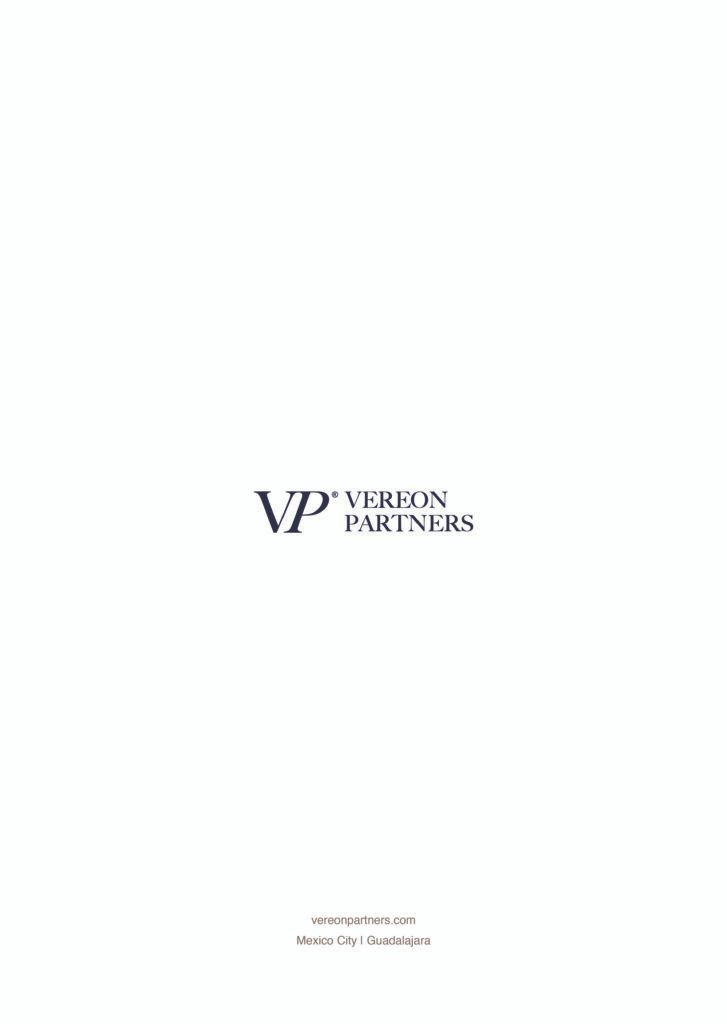
VEREON PARTNERS

Investment Banking

For VEREON PARTNERS – M&A & Capital Advisory, we crafted a brand identity that balances institutional credibility with a forward-thinking edge. The objective was to respect the visual codes of investment banking—structure, precision, authority—while avoiding the predictable, overly corporate aesthetic. We built a refined palette around navy blue and white as the core, complemented by warm neutrals such as beige, café and grey-blue tones to bring depth and distinction. The result is a minimalist, modern identity that feels conservative yet visionary—designed to position Vereon Partners as a trusted, strategic actor in the world of finance while standing apart with subtle sophistication.

Industry

Investment Banking

Location

Mexico

The Concept

For VEREON PARTNERS, the concept was to balance institutional authority with a visionary perspective. We respected the visual codes of investment banking while elevating them through a refined navy and white foundation, enriched with warm neutrals to create a minimalist, modern identity that feels both credible and distinctive.

The Identity

Logo & Visuals:
A refined and structured logotype designed to reflect precision, strategy and trust — essential pillars within the M&A and capital advisory landscape. The visual direction is clean and intentional, expressing institutional strength while maintaining a modern and distinctive presence.

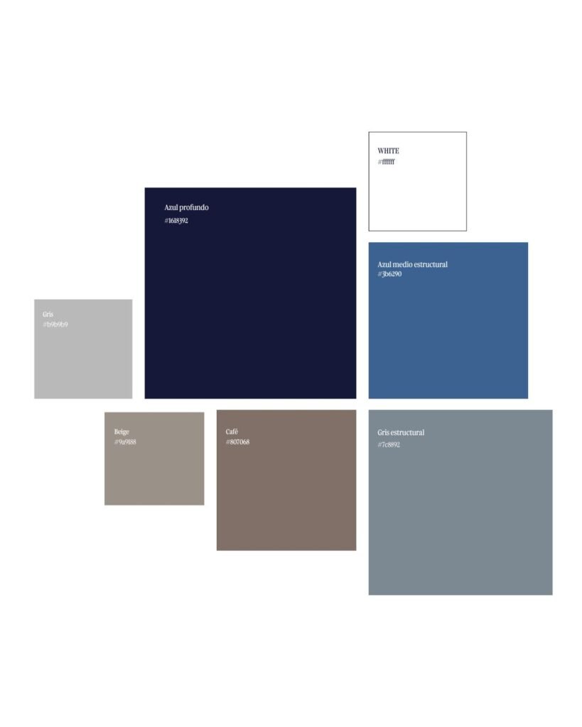
Color Palette & Typography:
A deep blue anchors the identity, complemented by neutral tones, grey and blue-grey nuances to create depth and quiet sophistication without relying on a predictable corporate palette. The typography combines a condensed typeface for titles with a simple, corporate font for body text to ensure clarity and professionalism.

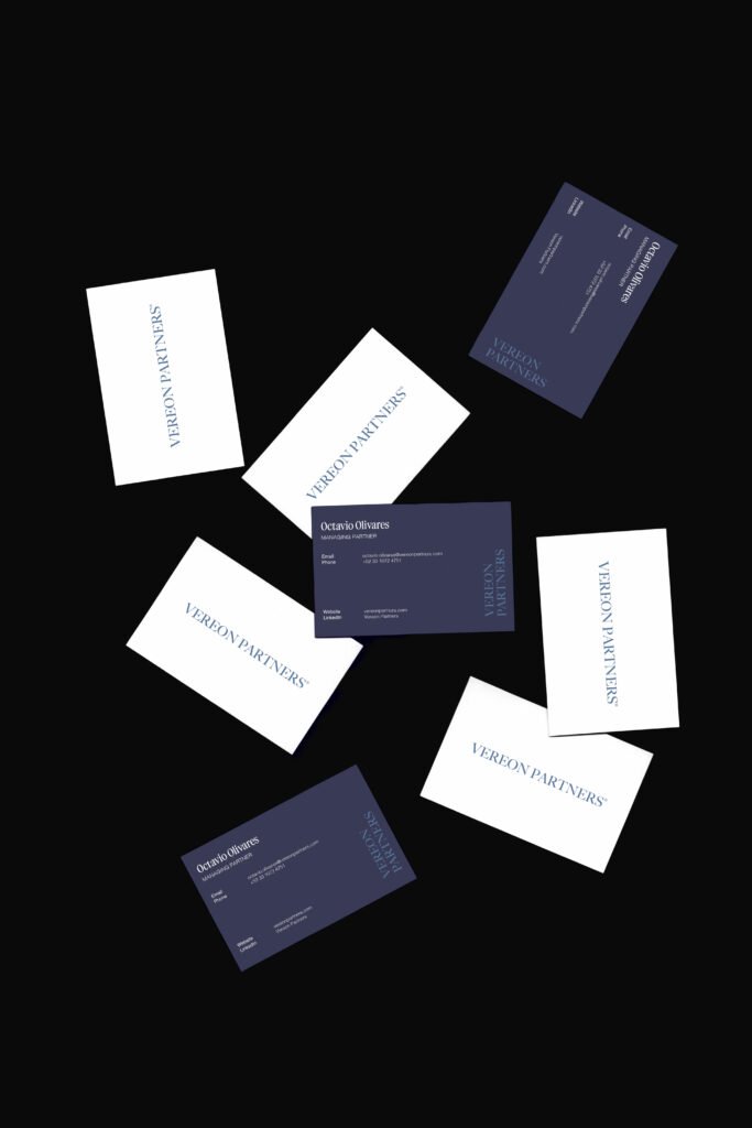
Brand Assets: Design of the business cards, email signatures, and corporate folders for presentations and official documents, ensuring a cohesive and elevated brand experience across all communications.